Disrupt and Design: Online Strategies for Equity, Inclusion, and Belonging
How might online learning support our work disrupting inequitable systems and practices in education?
GOA’s Disrupt and Design framework is based on the premise that “our current systems perpetuate inequity by design” and so it is our responsibility to actively disrupt those systems and redesign them. By first identifying what needs to be disrupted, we are both acknowledging inherent inequities and we are committing to designing new systems that address them.
As more and more of us return to primarily in-person learning, intentional, learner-centered use of online learning presents us with unique opportunities to avoid replicating certain systems and structures in our brick-and-mortar schools. From physical layouts of classrooms to content coverage to all sorts of embedded programs and systems in schools, how can we use online learning to help us reimagine these elements in order to design them to be more equitable?
In this post, we offer two potential pathways: accessible design and responsive design.
Accessible Design
Accessible design is designing an online learning environment in a way that creates entry points for all kinds of learners. While many countries around the world have governmental standards or regulations related to accessibility and digital technology, accessibility should not be reduced to a simple checklist; it should be an embedded mindset.
By designing for accessibility, we are designing for the margins: those who are traditionally left outside of the consideration of what’s the “average” or “typical” student who makes up the core of our student bodies.
It’s important to realize that if you design for the margins by focusing on accessibility, not only are you capturing the students on the periphery, you’re also capturing what’s in the core. This phenomenon is often described as “Curb-Cut Effect”, where innovations designed for a narrow audience (in this case, slopes in curbs that make it easier for people in wheelchairs) have a broad positive impact on all of us (people with strollers, suitcases, or bicycles).
How It Shows Up
When thinking about how accessibility shows up in learning design, consider three broad categories: language, multimedia, and visual design.
Accessible Language: When presenting content online, identify complex vocabulary and concepts and use simple language to clarify them for students. While this helps learners who may be engaging with materials in a language other than their own first language, this supports all learners' comprehension of the new concepts and terms.

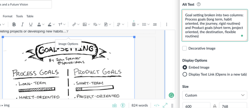
Accessible Multimedia: Ensuring images and video content are accessible to all learners creates a more equitable experience. Alternative text, or “alt text,” on course images, graphics, or other visuals in a course page is read aloud by assistive technology like screen readers (that may be used by learners with low vision or no vision). If an image fails to load given low-bandwidth or other unexpected reasons, alt text also displays in place of the image, ensuring your learners don’t miss out on any contextual information that use of the image conveyed.

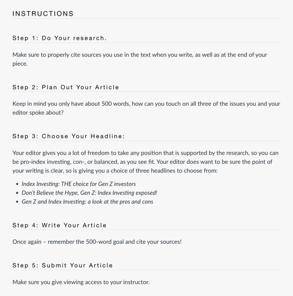
Accessible Design: Chunking or grouping content into manageable sections aids in information processing and encoding in learners’ brains.

When lists are formatted properly, non-sighted learners with a screen reader will be able to distinguish the number of items in a list, and be able to jump from list to list in the content. When lists are created correctly, they are also easier for sighted learners to scan and read.
Apply It
Run an accessibility check either directly in your Learning Management System (most platforms have embedded accessibility tools) or through an external web-based application like WAVE, the Web Accessibility Evaluation Tool. GOA’s Accessibility Checklists are also available as a free download on our website.
Responsive Design
As Indu Chugani Singh writes in Creating the Space for Equity, “An equitable learning environment is one that privileges difference... and its first priority is positioning the learning of the course in relation to the diversity of students in the classroom and those students’ needs.” Responsive design disrupts the “one size fits all” model of school by ensuring the school environment adapts to who students are, rather than asking students to adapt who they are to the school environment.
At GOA, we’ve spent a decade collecting data from students about online experiences, and we’ve learned that online spaces are responsive when they prioritize connection and student voice. This is an especially helpful strategy when using online spaces to reimagine what it means to “participate” in class.
How It Shows Up
In "The Power of Protocols for Equity", Zaretta Hammond offers four core principles for designing culturally responsive participation structures:
Honor the funds of knowledge each student brings to the conversation.
Give marginalized students greater access to the flow of the discussion.
Give students more agency in directing the conversation.
Give students a more robust cognitive workout by leveraging their everyday modes of communication.
Student Support. Responsive design honors the funds of knowledge each student brings to the conversation. At GOA, our student support system is built on email “nudges” rather than standardized, punitive actions. Whether the step is to check-in, create a plan, commit to action, or communicate intentions, the support is responsive to the student’s needs and involves them in defining what support will look like.
Backchannels. Live classroom discussions can feel fast-paced and free-flowing, which is exciting to some students but can be alienating to others. A backchannel is a way to give marginalized students greater access to the flow of the discussion. Offering a text-based, asynchronous option for engaging with teachers and peers during a live class invites more students into the conversation.
Pre-flection and Reflection. Letting students prepare for and reflect on learning experiences online gives them a more robust cognitive workout by leveraging their everyday modes of communication. Bookending learning experiences with asynchronous goal-setting and self-assessment gives every student the opportunity to share their prior knowledge and their learning, and it supports metacognition and deeper processing of course content.
Asynchronous Discussion. Integrating online interactions into your approaches to discussion gives students more agency to drive the conversation. Online, students can pause, reflect and compose their responses to prompts or to conversation. Asynchronous discussions are especially effective when you ask students to connect course content to what they know, what they experience and what they care about.

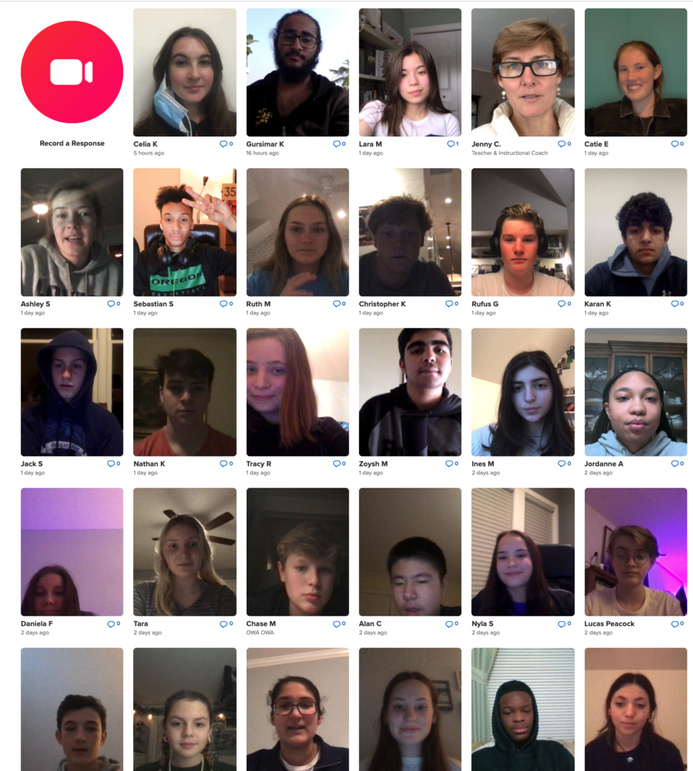
Asynchronous interaction tools like Flipgrid can be integrated into in-person learning to allow students the time to set goals, reflect on learning, and participate in class in a more self-paced way.
Apply It
Identify one way you currently ask students to participate in person in your class. What might it look like if you moved that participation element into an online space via asynchronous interaction? How might introducing that online element to class participation structures communicate to your students that you are being responsive to the different ways that they might be showing up to your class?
These ideas are just two potential pathways towards the important work of designing for equity: knowing the elements that currently define your work and identifying which elements you need to disrupt in order to redesign.
The GOA team will be presenting at the NAIS People of Color Conference on December 1, 2022.


