From User Experience to Learner Experience: Why Usability Matters in Online Learning
During the COVID-19 pandemic, we have seen an unprecedented number of learners engaging online. Teachers have quickly pivoted from in-person instruction to virtual classrooms. In this hurried transition, essential design considerations might be overlooked – whether intentional or not. However, many schools and learning organizations are now considering how online learning aligns with their long-term goals and strategies. High-quality design is an essential part of a successful online or hybrid learning program.
When developing an online course, we need to be thinking about designing experiences, not just instruction. Beyond simply the transfer and acquisition of knowledge and skills, designing for learning experiences is outcomes-driven, goal-oriented, and human-centered.
In this series of short blog posts, we are going to break down principles borrowed from the world of user experience (UX) design and demonstrate why they matter in creating impactful, inclusive learning experiences for students. We will write about how these principles apply specifically to online spaces, but educators will recognize their relevance to how we design all kinds of spaces and experiences for learning, whether they are online or not. This is the first post of three. Keep an eye out for the next two in coming months!
Why Usability Matters in Online Learning
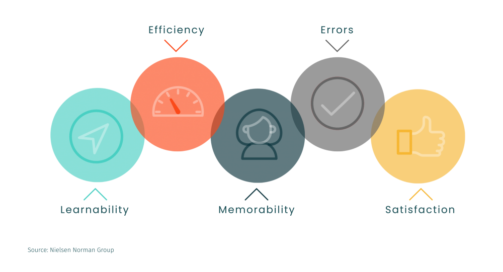
Usability, a specific measure used in the broader context of user experience design, is focused on the effectiveness, efficiency, and overall satisfaction of using a system or product. Pioneer user experience research firm, Nielsen Norman Group, outlines five components of usability:

Learnability: How easy is it for users to accomplish basic tasks the first time they encounter the design?
Efficiency: Once users have learned the design, how quickly can they perform tasks?
Memorability: When users return to the design after a period of not using it, how easily can they reestablish proficiency?
Errors: How many errors do users make, how severe are these errors, and how easily can they recover from the errors?
Satisfaction: How pleasant is it to use the design?
We can and should take these concepts and apply them to online learning experiences – whether that be a 15-week academic course for high school students or a 4-day intensive online workshop for adult learners. When usability is infused into the experience, cognitive efforts are focused on learning the instructional content, not the course system or structure. Designing for usability is rooted in the need to understand and anticipate human behavior, and usability factors influence both interface and experiential design of your online learning experiences. Let’s take a look at how these principles might play out in an online course.
Learnability
How easy is it for users to accomplish basic tasks the first time they encounter the design?
When learners arrive at your course for the first time, they should be able to quickly orient to the learning environment. It is helpful to design a “homepage” that highlights critical information about the course structure, pacing, and navigation. You should also offer clear guidance on how to get started in the course – a checklist can often be a helpful visual element to apply for this purpose.
Efficiency
Once users have learned the design, how quickly can they perform tasks?
As learners get accustomed to the structure and pacing of your course, they should be provided with multiple means of navigation to create efficiency in their movements across the courses. A high-level, module view enables learners to jump directly to a content item or activity, while paginated navigation enables learners to flow item-by-item through the experience. Efficiency is really about providing time-saving alternatives for your advanced users – a familiar analogy might be the use of built-in keyboard shortcuts in word processing applications, like Google Docs or Microsoft Word. Users new to the application might leverage the dropdown menu to complete actions, but seasoned users turn to the efficiency of shortcuts.
Memorability
When users return to the design after a period of not using it, how easily can they reestablish proficiency?
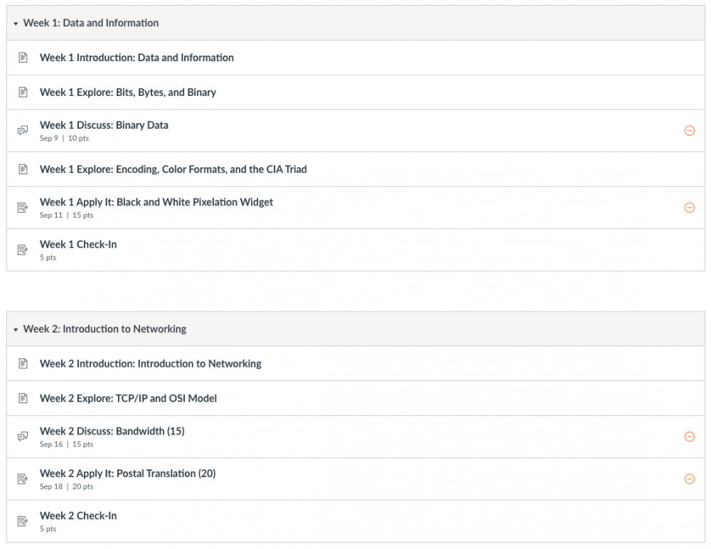
Imagine if you completely rearranged your classroom every day. When students walked in, the whiteboard or screen had been relocated, classroom materials were in a different place, and the seating arrangement was different. Students would have to spend time and energy reorienting themselves to the design of the space before being able to settle down to learn. The same principle applies to your online learning environment. Standardize the organization and language used for recurring course elements. For example, if a course uses the convention “Module #”, carry that forward across all content items. As elements are repeated, learners will build familiarity with activity and content types and their associated expectations.

The weekly module structure in this course is standardized – always with an introduction to the topic, exploration of content, opportunities to connect with others and apply their learning, with a closing check-in activity with their instructor.
Errors
How many errors do users make, how severe are these errors, and how easily can they recover from the errors?
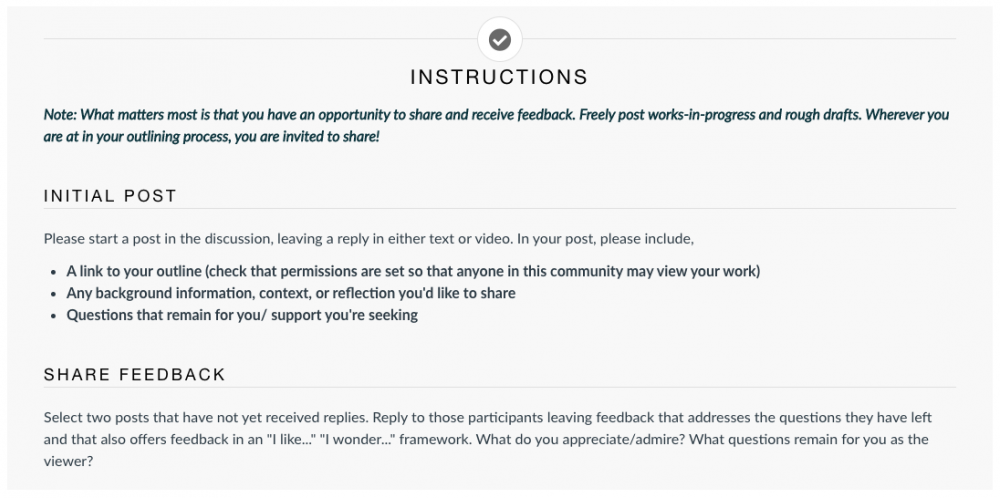
Traditionally, error prevention in the context of user experience is all about minimizing frustrations. Throughout your course, you should offer clear guidance for navigation and instructions for expectations. For example, the use of consistently styled visual callout boxes to share important due date information for assignments. You might also feature a prominent button to “Get Help” or “Get in Touch” linked to your contact information on a commonly visited course location like the homepage. Learners shouldn’t have to expend cognitive load on how to navigate your course from unit to unit – you want that brainpower focused on instructional content.

This discussion page clearly delineates instructions for engaging in initial responses and replies to peers.
Satisfaction
How pleasant is it to use the design?
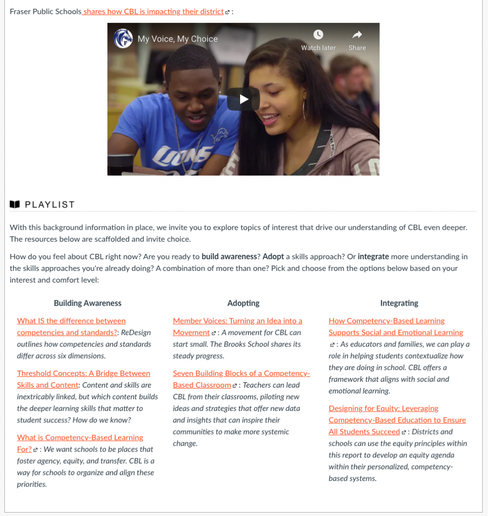
Your online course should leverage appealing visual design – avoiding unnecessary or exaggerated use of color, images, or graphics. As noted in the Aesthetic Usability Effect, when a person perceives a design as aesthetically pleasing, they will also find the design easier to use. A visually cluttered course page not only distracts the learner from your instructional content, but may also introduce accessibility issues to the experience.

This course uses headings and columns to create a clean, organized layout.
Take Action
So, what can you do right now to make your learning experiences more usable?
Falling back on steadfast UX advice, solicit feedback from your users – reach out to your learners to better understand how they experience your online course. Do they perceive the online environment to be easy and efficient to engage with? Can you identify trends where navigation or guidance causes frustration? What elements of your course do they like the most? Often, the feedback you hear from users will inform specific, actionable steps to create a more usable, impactful learning experience.
To learn more about principles of instructional design, read these GOA resources:
- From User Experience to Learner Experience: Seven Key Concepts in Effective Online Learning Design
- From User Experience to Learner Experience: How to Prioritize Accessibility in Online Learning
- GOA Online Course Style Guide
The GOA Design Lab conducts design audits, providing schools and learning organizations with a detailed review of and comprehensive report on the design of online spaces they use for online and hybrid learning. The audit covers key areas of instructional and user experience design like those described in this article.


