From User Experience to Learner Experience: How to Prioritize Accessibility in Online Learning

In this series of short blog posts, we break down principles borrowed from the world of user experience (UX) design and demonstrate why they matter in creating impactful, inclusive learning experiences for students. We will write about how these principles apply specifically to online spaces, but educators will recognize their relevance to how we design all kinds of spaces and experiences for learning, whether they are online or not.
In the last post of our from UX to LX series, we outlined critical components that make an online learning experience effective, efficient, and satisfying. In this post, we explore accessibility considerations that ensure all learners can fully engage with the experience. When you design with accessibility in mind from the start, you create a better learning experience for all participants. Accessibility should not be reduced to a simple checklist in your course design process – it should be an embedded mindset.
Besides creating a more inclusive environment for your learners, many countries around the world have governmental standards or regulations related to accessibility and digital technology. In the United States, Section 508 requires any government agencies to make their digital or web products accessible to everyone. This policy extends to any institution of learning; whether public or private, those receiving federal funding must ensure that all online and digital content meet accessibility standards.
Using input and guidance from expert voices and global organizations, the World Wide Web Consortium’s Web Content Accessibility Guidelines (WCAG 2.1) outline technical specifications and differing levels of compliance to help build a more accessible, equitable Web for all. Let’s take a look at a few ways GOA considers accessibility across three of the four WCAG principles.
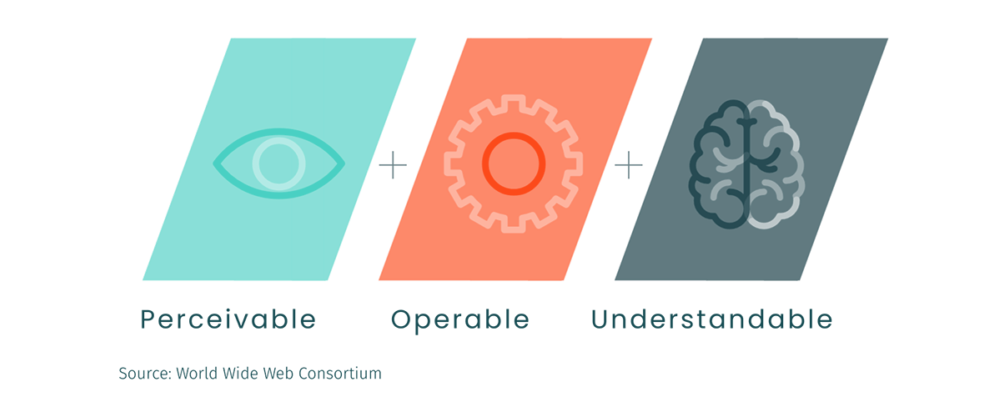
Three Essential Elements of Accessibility in Online Learning
1. Perceivable
Can the user identify and engage with the content?
Accessible Media
A large task in inclusive course design is ensuring multimedia are accessible. You should always add substantive alternative text, or alt-text, to images, graphics, or other embedded visuals in a course page to describe the meaning of content to learners who cannot see them. If an image fails to load given low-bandwidth or other unexpected reasons, alt-text also displays in place of the image – ensuring your learners don’t miss out on any contextual information that use of the image conveyed.
Avoid using text-heavy images, especially if resolution is low. Often, adequate alt-text is impossible to describe the image in its entirety. Rebuild the text-heavy images as HTML page content; if that is impossible, consider finding an alternative.
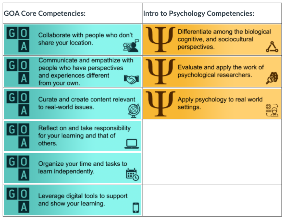
Course competencies are shared in JPG format, using a table for layout – which are inaccessible and difficult to navigate to learner with visual impairment.
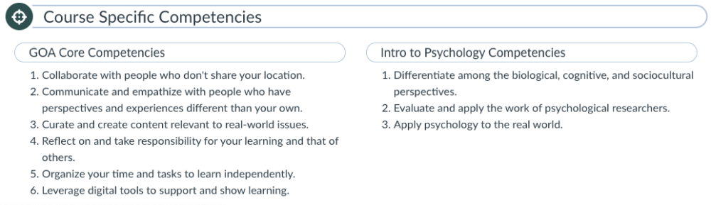
In the updated version, content is moved into a two-column layout using CSS, headers are added, and text items are moved into numbered lists.
For learners who experience hearing impairment or for whom the primary language of the course is not their primary language, video content should feature closed captions or be accompanied by a full-text alternative (in a Google document or Word document; PDFs are not often fully accessible without additional measures).
Using Color
Color can often be used on text or navigational elements to convey meaning, but be wary of when it is used exclusively to denote importance, such as using red text or applying a yellow highlight on an assignment page. Colorblind learners will not pick up on the importance of text if color only is used to convey meaning. Instead, use a callout box, heading structure, or other treatment to make important instructions stand out.
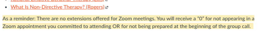
Text uses a yellow background to highlight an important reminder to students.
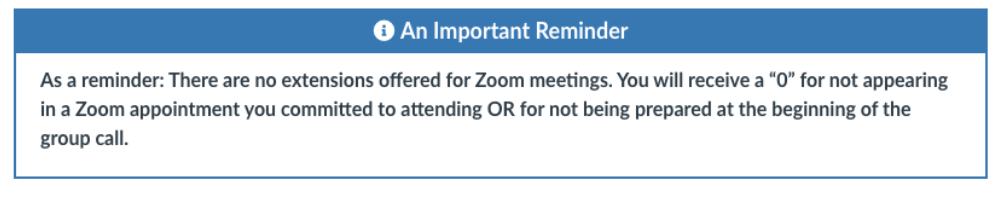
In the updated version, the reminder is moved into a callout box with a header “An Important Reminder” and text is bolded to communicate significance.
When text or other critical elements feature low color contrast, legibility can similarly be impacted for learners with visual impairments. WCAG provides guidance on acceptable contrast ratios between foreground and background – you can perform a quick contrast check on different type sizes through WebAim’s Contrast Checker.
2. Operable
Can the user distinguish and navigate between page elements?
Element Structures
Your course and page elements – such as lists, tables, or headings – should feature and follow standardized structures. When presenting listed items, either using bullets, numbers, or letters, use appropriate tools in your Learning Management System to style your content. Many platforms have a Number list or Bullet list tool specifically for this use. Nest list elements to create structure and to convey relationships between items.
When lists are formatted properly, visually impaired learners using a screen reader will be able to distinguish the number of items in a list, and be able to jump from list to list in the content. When lists are created correctly, they are also easier for sighted learners to scan and read.
In the brief example below, the screen reader recognizes the headings and listed items on the page. The alt text applied to the image is scant and not substantive enough to stand in for the visual information therein.
Accessibility: Screen Reader Demo
3. Understandable
Can the user comprehend and remember how to use course features?
Hyperlinks
Descriptive hyperlinks provide learners with important context of where the link location leads. Avoid using generic language, like “click here” or “more here”, and replace often lengthy URLs made up of characters and letters with readable, meaningful text. Visually imparied learners may use a screen reader to navigate the course, moving from link to link using a tab key. Providing link text that is substantive is important to their experience.
Take Action
So, what can you do right now to make your learning experiences more accessible?
This post has explored only a few considerations in designing more equitable, accessible online learning experiences. While the complexity of accessibility standards can seem immense, we recommend starting small and scaling efforts over time. A simple step to start your accessibility journey might be to run a check – either directly in your Learning Management System (most platforms have embedded accessibility tools) or through an external web-based application like WAVE, the Web Accessibility Evaluation Tool – that will help identify where improvements are needed.
To learn more about principles of instructional design, read these GOA resources:
- From User Experience to Learner Experience: Why Usability Matters in Online Learning
- From User Experience to Learner Experience: Seven Key Concepts in Effective Online Learning Design
- GOA Online Course Style Guide
The GOA Design Lab conducts design audits, providing schools with a detailed review of and comprehensive report on the design of online spaces they use for online and hybrid learning. The audit covers key areas of instructional and user experience design. Learn more and submit an inquiry.