From User Experience to Learner Experience: Seven Key Concepts in Effective Online Learning Design

In this series of short blog posts, we break down principles borrowed from the world of user experience (UX) design and demonstrate why they matter in creating impactful, inclusive learning experiences for students. We will write about how these principles apply specifically to online spaces, but educators will recognize their relevance to how we design all kinds of spaces and experiences for learning, whether they are online or not.
As noted in our first article in this series, when a person perceives a design as aesthetically pleasing, they will also find the design easier to use. An effectively designed learning experience not only increases usability, but may also provoke emotion and delight in your learners – which can positively affect learning and strengthens perceptions of your instruction or of your institution or school.
While artists have been studying and applying design concepts since antiquity, designer and educator William Lidwell published what is now considered to be the preeminent reference book defining the Universal Principles of Design in 2003. For our focus, we’ll explore the seven concepts below.
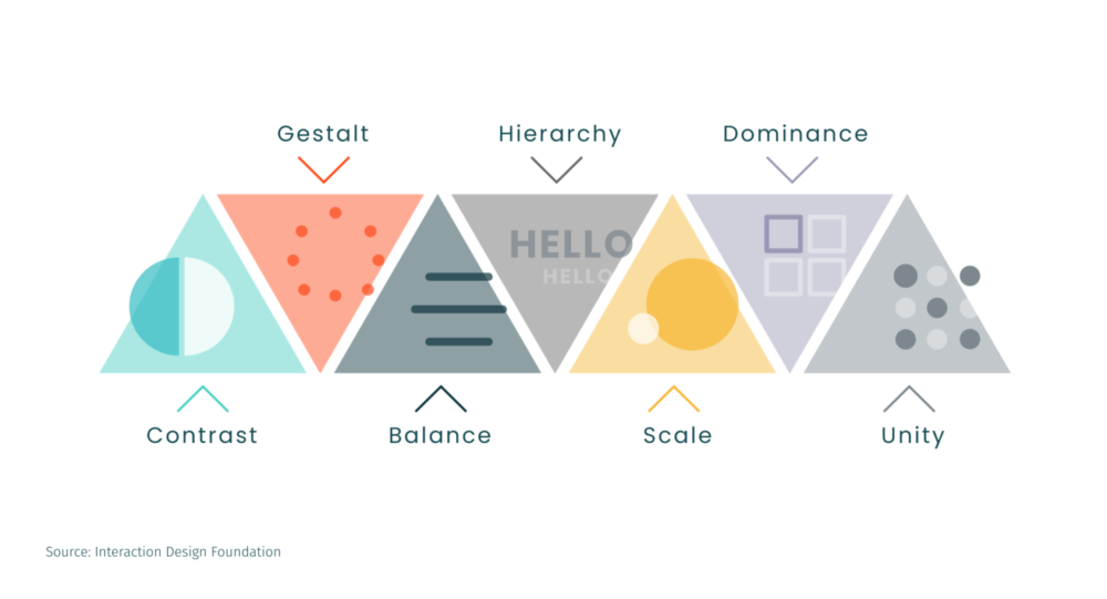
Contrast: Are important elements visually distinguished in your design?
Gestalt: Does your design group common elements and feature clear sections?
Balance: Are elements equally distributed in your design?
Hierarchy: Does your design delineate the relative importance of elements?
Scale: Does your design use size and shape to convey relevance?
Dominance: Are single “focus elements” used across your design to draw attention?
Unity: Does your design create harmony between elements?
These principles hold relevance across many domains – from architecture to cinematography – but let’s take a look at how these considerations show up in designing online learning experiences.
Seven Key Concepts in Effective Online Learning Design
Contrast
Are important elements visually distinguished in your design?
A common application of the Contrast principle is seen in hyperlinks – they should be distinctly styled from surrounding text. In addition to using color (in an adequate color contrast from surrounding text), it is standard practice to display hyperlinked text as underlined by default or underlined on hover to imply interactivity. When features that function similarly – such as hyperlinks – also look similar, learners will immediately recognize the text as clickable.
Hyperlinks are consistently styled as orange, underlined text to stand in contrast to other course page content.
Gestalt
Does your design group common elements and feature clear sections?
The Gestalt principle refers to the human brain’s tendency to perceive a sum or whole of individual parts. In course design, this is applicable in creating clear content sections or chunking information. Avoid long pages of text with little visual breaks and design sections by using breaks, headers, and alternating background colors. For a given page with a long vertical scroll, you might break the content down across multiple pages. Grouping instructional content into manageable sections also aids in information processing and encoding in learners’ brains.
Subtle shifts in background color and consistently applied headers help visually distinguish the various sections on this course page.
Balance
Are elements equally distributed in your design?
By definition, the Balance principle refers to the distribution of visual weight within a composition. While visual weight can manifest through the attributes color, contrast, and density, the most common and relevant to course design is size. Across navigational elements of similar type of purpose, ensure that all feature equivalent size, style, and spacing. Creating balance in this way implies to the learner that each element is of equal importance.
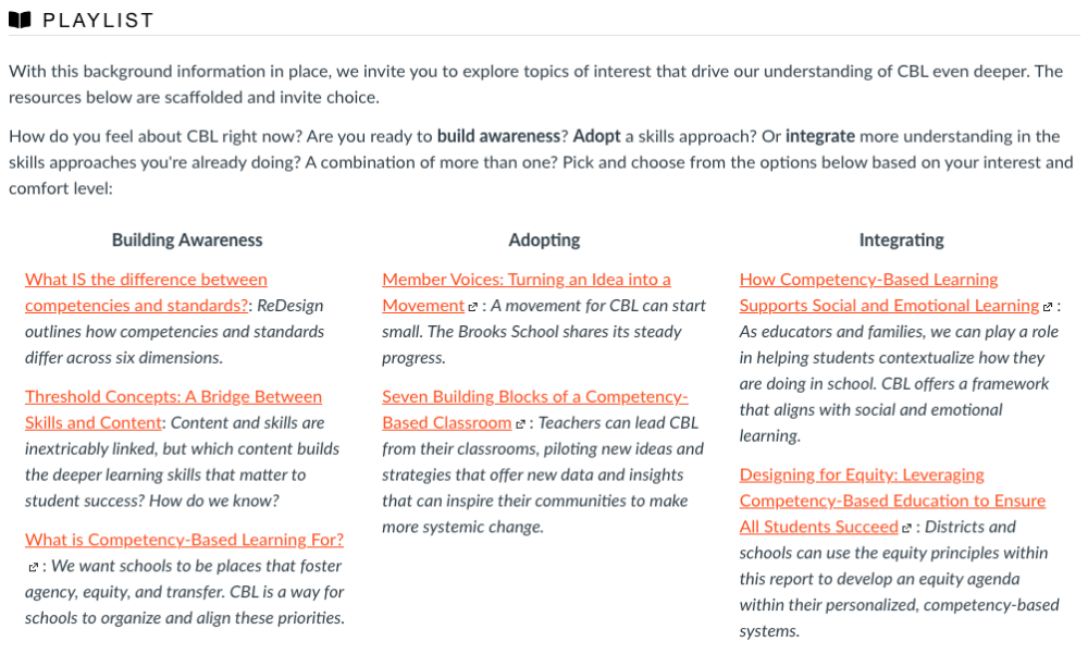
A playlist of resources is presented in a three-column layout, all preceding by a standard heading size to imply balanced and equal significance.
Hierarchy
Does your design delineate the relative importance of elements?
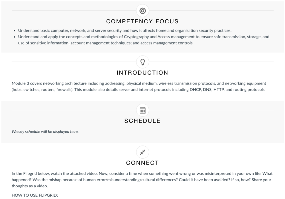
Headings can be used to establish Hierarchy across your course content and help visually establish the relationship between content items. By grouping instructional content into manageable sections, information processing and encoding is better supported in learners’ brains. Properly applied headings also enable the learner to quickly scan and orient to the page content. Headings give learners a sense of the page’s organization and structure. Always apply headings sequentially (i.e., H1, H2, H3, H4, etc.) to build a hierarchical relationship between content.
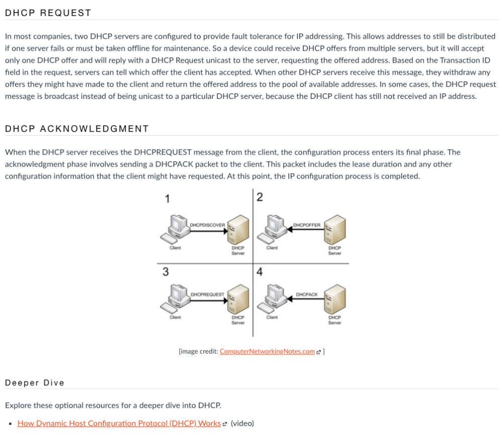
Use of headers show sections top-level topics DHCP Request and DHCP Acknowledgement, followed by a sub-topic Deeper Dive.
Scale
Does your design use size and shape to convey relevance?
Naturally, learners will take notice of large text used on a course page. If you have applied this trick in your learning experiences, you are putting the Scale principle to use. This principle, which helps describe the relationship of elements based on relative size, can be applied not only in size of discrete elements (for example, like text using a heading structure as mentioned above), but also in page layout. For optional information or additional resources, you might leverage a sidebar that sits to the right of your primary, required content. The scale (and placement) of the sidebar implies to the learner that this is secondary to the main body content.
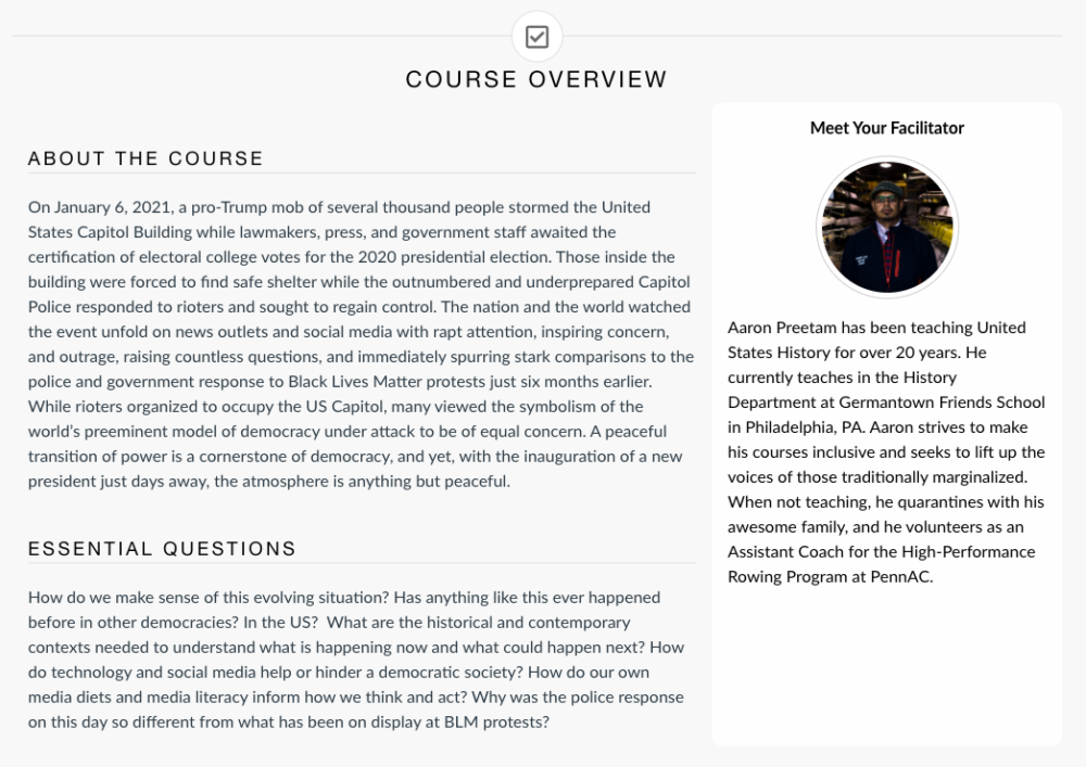
The sidebar featuring the instructor’s biographical information is strategically placed in a sidebar – appearing as secondary in relevance to the main body’s About the Course and Essential Questions sections.
Dominance
Are single “focus elements” used across your design to draw attention?
Dominance, or sometimes called Emphasis, concerns the focal point within a composition. The Dominance, Scale, and Hierarchy are closely related principles, and while relative size is one way to affect emphasis, it can also be achieved with color, contrast, and placement. In your course, you might use Dominance to visually call out an important set of instructions. By using a call out box to highlight key text, Dominance is created with use of different proportions, contrasting color, varying placement, and leveraging white space.
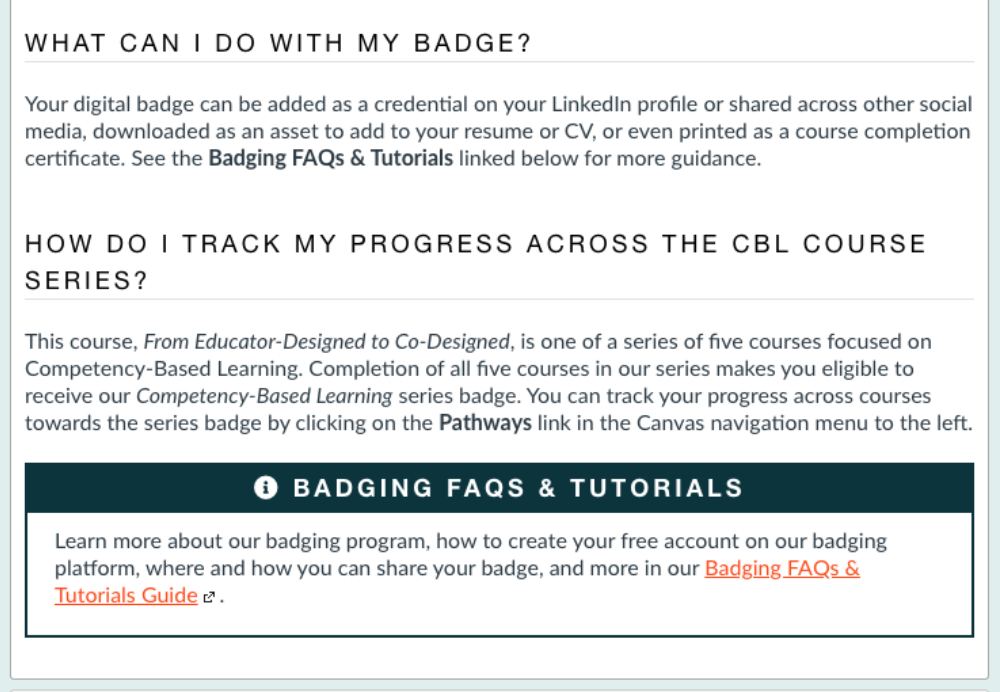
The callout box featuring important information about course badging stands apart from the surrounding text
Unity
Does your design create harmony between elements?
The Unity principle is about creating a cohesive experience for your learners. It is a comprehensive concept that can apply to a broad range of course elements – from colors and typeface to structure and language. When you effectively apply the previous principle and intentionally design for accessibility and usability, you create a unified, consistent experience for your learners.
Take Action
So, what can you do right now to incorporate design principles into your learning experiences?
While the number and complexity of these principles may seem daunting, you can start small – prioritizing one or two to intentionally apply in your online learning experiences. Because many learning management systems have header formatting built directly into their content editors, Hierarchy might be a place to focus early efforts.
Throughout this series, we have broken down concepts and principles borrowed from the world of user experience (UX) design and demonstrated why they matter in online learning. GOA has pulled some of these concepts together into clear, actionable guidance for our teaching faculty. In sharing our Course Style Guide, we hope to inspire educators to modify and customize this advice to fit their context – encouraging a wave of more impactful, inclusive online environments for student learning.
To learn more about principles of instructional design, read these GOA resources:
- From User Experience to Learner Experience: Why Usability Matters in Online Learning
- From User Experience to Learner Experience: How to Prioritize Accessibility in Online Learning
- GOA Online Course Style Guide
The GOA Design Lab conducts design audits, providing schools with a detailed review of and comprehensive report on the design of online spaces they use for online and hybrid learning. The audit covers key areas of instructional and user experience design. Get in touch with us to learn more.